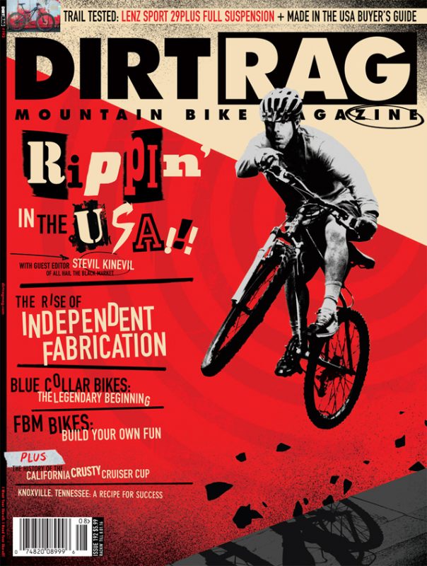
Dirt Rag #192: The Story Behind the Cover
Originally posted on June 28, 2016 at 0:51 am
By Stephen Haynes, Dirt Rag Art Director
While the wicked winds of winter were still whipping through west Pennsylvania (bringing with them a bounty of alliteration apparently), Dirt Rag editor-in-chief Mike Cushionbury and I were hatching plans for our latest issue.
Mike floated the idea of having blogger, artist and cycling personality Stevil Kinevil sit in as guest editor, which I thought was a great idea.
Knowing a little of Stevil’s work and history through his blog, allhailtheblackmarket.com, I knew he was a zine creator and aficionado (among many other things), which lead to the idea of turning this entire Dirt Rag issue into a zine of sorts.

I knew the interior pages of the issue would be mostly business as usual, but made to look as though they had been assembled with some sort of hands-on intervention, like hand-written headlines, skewed images, overlapping shapes, etc. Stevil’s editorial direction, contacts and personally sketched page numbers (look closely for them) helped the whole vibe out as well, shining a light on some of darker and/or lesser known corners of the bike industry.
The cover presented a special challenges since we wanted to allude to the interior content without losing clarity on the newsstand. Believe it or not, we spend a tremendous amount of time hand-wringing over cover content, from photo choice to cover lines. Everything is scrutinized until we have to pull the trigger and send the issue to the printer
As soon as we got the green light from Stevil that the issue was happening, I rang up my friend and illustrator, John Ritter.
John and I met at a Pittsburgh Society of Illustrators gathering about a year ago and have since found a lot in common. We both spent formative years in California, love punk rock, skateboarding and philosophizing about the impact of art and illustration on the world.
As a professional illustrator John has worked for every big client you can think of from Time magazine to Newsweek to the New York Times. Still, he told me he’s always wanted to do something for Dirt Rag, having been a fan for well over a decade. His photo augmentation/ paste-up style was a perfect fit for the zine issue and he and I began throwing ideas around.
I was reminded of the 1990’s and the influence and saturation of zines during that decade and so we used it as the catalyst for the imagery and verbiage on the cover. Employing a photo of a rider on a late model mountain bike, wearing classic Vans and no apparent specialized riding gear (other than a helmet) getting rad, John set about manipulating and refining the image, adding texture, shapes and color in a limited palette until we were both satisfied that he’d hit the mark.

The verbiage on the main cover line, “Rippin’ in the USA!!!” is a deliberate acknowledgment of slang from the 90’s as well, which saw a rise of similar jargon (bitchin’, bummer, stoked, gnarly, etc.) and complimented the overall vibe of the cover. The “ransom note” style lettering was a nod to the many, many punk rock concert flyers I assembled in my youth.
All in all, this issue was great fun. We even concocted the “Find the Skulls” contest to add another layer to the whole thing and we sincerely hope you enjoy it! (Enter the contest, here.) Perhaps the “zine” issue will become an annual thing? What do you think?