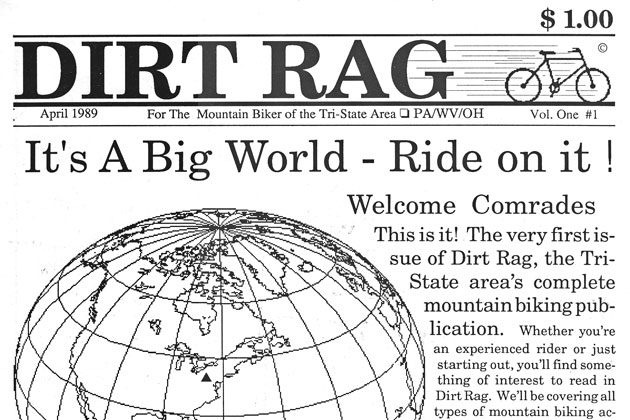
A brief history of the Dirt Rag cover logo
Originally posted on July 16, 2015 at 10:33 am
The cover of Issue #1 featured the catchy name “Dirt Rag,” a liberal use of clip art and the immortal slogan “It’s A Big World—Ride on it!” But no official logo.

By Issue #2 we’d adopted the above logo that featured a unique, scrawling font (created by Steve Chaszeyka of wizardairbrushgraphics.com).

In October 1989 we introduced die-cut stickers with the original logo—in a dazzling yellow/red color combination that would become Dirt Rag’s de facto “team colors,” adorning the initial run of team jerseys that went out to staff, contributors and close associates.

Speaking of colors, Issue #28 sported our first-ever color cover, but it wasn’t until DR #29 that we took a paintbrush to the logo. Despite the switch to color covers, the logo remained mostly a black-and-white affair for the next several years.

Sometimes we made exceptions to the “standard” logo treatment. For instance, when the cover artist incorporated a stylized logo into their original work. The above cover from DR #32—created by then Art Director Mark Tierney—is one such example.

During his tenure as Art Director, Mark created a new logo that featured a white “DIRT” inside a black box, stacked above a lower case “rag” that had a marbled texture to it. The new logo dropped on the cover of DR #56. Occasionally the “rag” was lightened, or even colorized, as the cover art dictated—but the stacked logo remained essentially unchanged for the next several years.

Jeff Guerrero was Art Director when we switched to a horizontal logo on DR #84. The new design featured a white “DIRT” inside a black box, and black “RAG” inside a white box. Both the letters and the boxes had “wavy” edges. The letter “R” in “DIRT” incorporated an art icon, and the R-art usually changed from issue to issue. The horizontal treatment allowed more room for the tag line “The Mountain Bike Forum,” which we introduced on the cover of DR #80.

The horizontal logo was modified for DR #111. The black box around the “DIRT” was eliminated, which allowed more of the cover art to show through.

Current Art Director Matt Kasprzyk modified the horizontal logo for DR #160 when he sharpened up the wavy edges on the letters and borders. By this time we’d already stopped using the R-art (the final issue with the R-art was DR #156).

On the cover of DR #167 Matt reversed the white/black portions, creating a black “DIRT” and a white “RAG” (with the word RAG inside a black box). Since DR #167 the black “DIRT” logo has been the predominant version, with the white “DIRT” version appearing occasionally, when aesthetics dictated the switch.

One notable exception: We added a splash of silver ink to the cover of Issue #176 to commemorate our 25th anniversary. Clink!
Keep reading
We’ve published a lot of stuff in 26 years of Dirt Rag. Find all our Blast From the Past stories here.